Logo Design + Branding System
Vista Living Care
Santa Fe, New Mexico
Memory care of our elder population is an issue near to our hearts, and we couldn’t have found a better company to work with on rebranding in that industry than Vista Living Care. With three beautiful adobe houses in New Mexico, the most used word in the company’s name is Vista, meaning “View.” Anchored in the Southwest, we wanted to uphold a design scheme that resonates with our region. Beyond this goal, we also wanted to honor Vista Living’s mission as a family-owned business that loves and appreciates their surroundings, never overlooking a beautiful view, sunrise, sunset, mountainscape, or night sky. Like Vista Living’s homes, we worked to create a comfortable aesthetic which can lift the mood and be enjoyed.
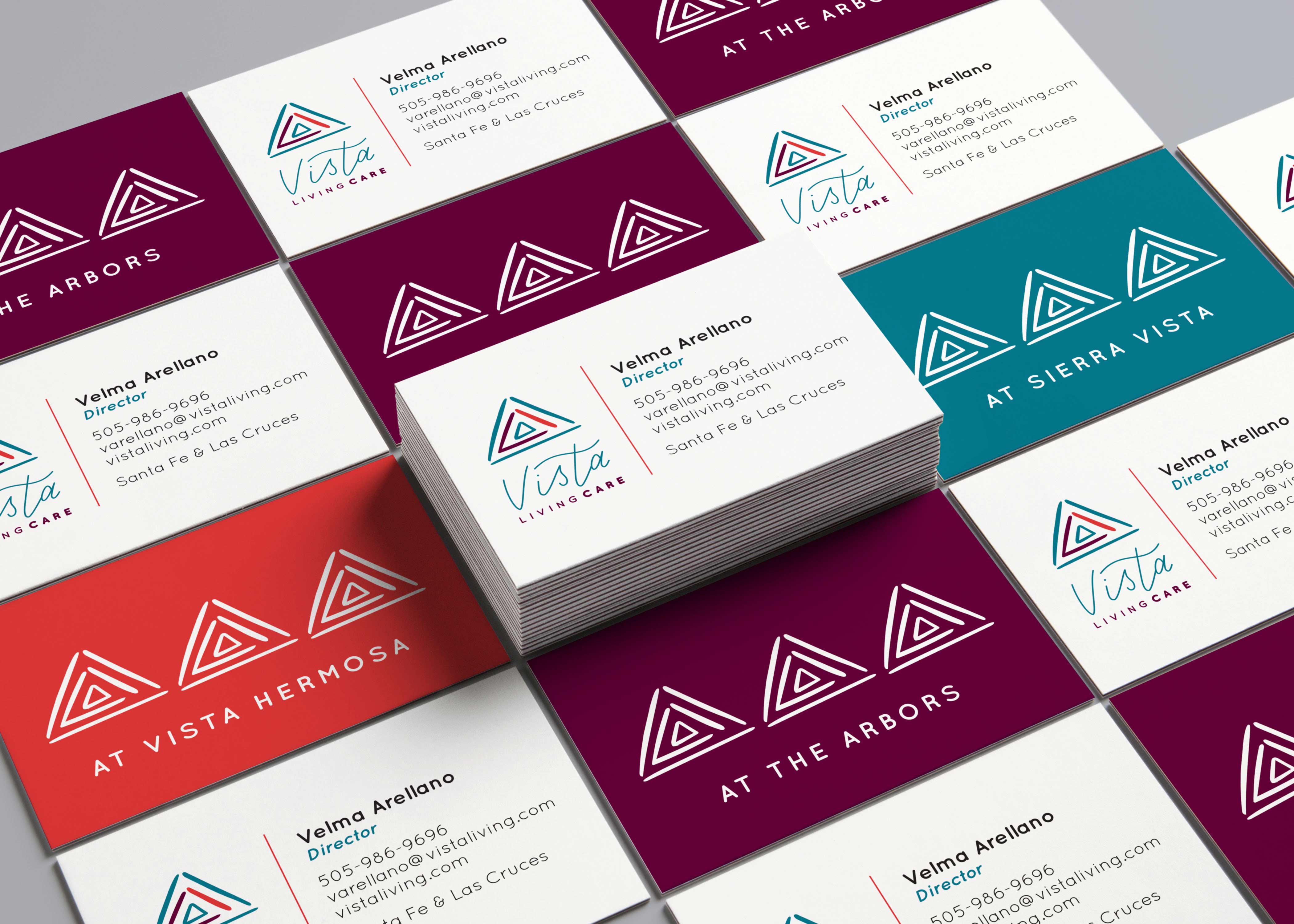
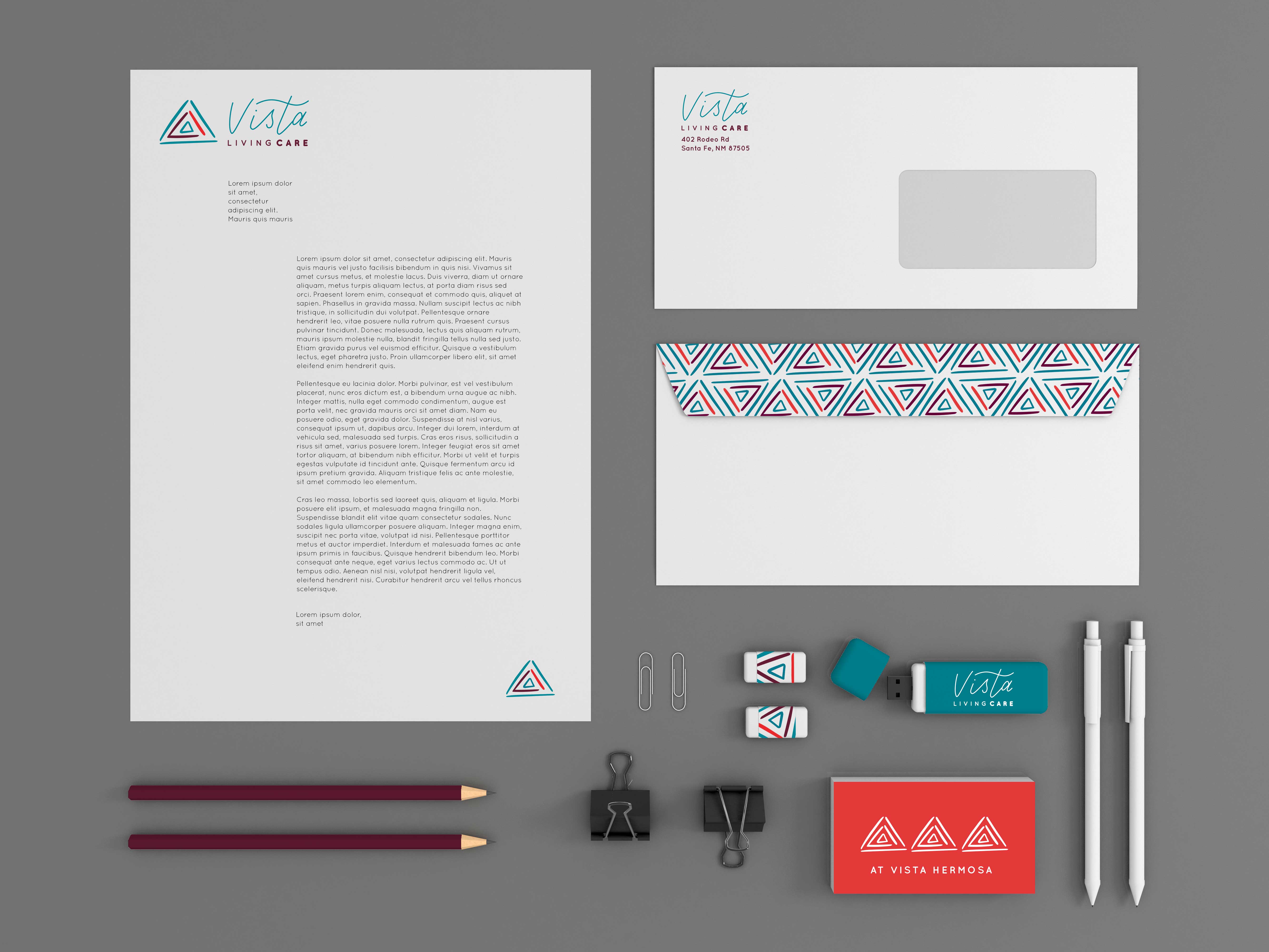
Our logo design references the triangular shapes and feel of brushstrokes found in regional pottery art, which is a prominent feature in the decor of each house, as well as the mountain ranges which surround these lovely homes. The logo typography is lettered to perpetuate a feeling of nurture, care, and touch of the hand. Our color system is a brighter and more contemporary take on the classic Southwest palette, and helps delineate the three locations of this business, with coral, teal, and plum for each. The logo mark is used in single, triple, and repeating formats to enliven stationery and other print materials.

